Travel Mode: Change the Unchangeable
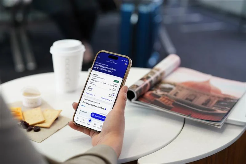
United's mobile app is the industry leader—customers choose to fly United specifically because of it. Yet year after year, customer surveys revealed a consistent frustration: 'I love the United app, but I can never find anything.
The app was packed with powerful features, but they were scattered across the interface based on internal logic rather than customer needs. Our challenge: reorganize the entire day-of-travel experience into a dedicated, intuitive space that makes critical information accessible exactly when passengers need it.
“I love the United app but I can never find anything.”
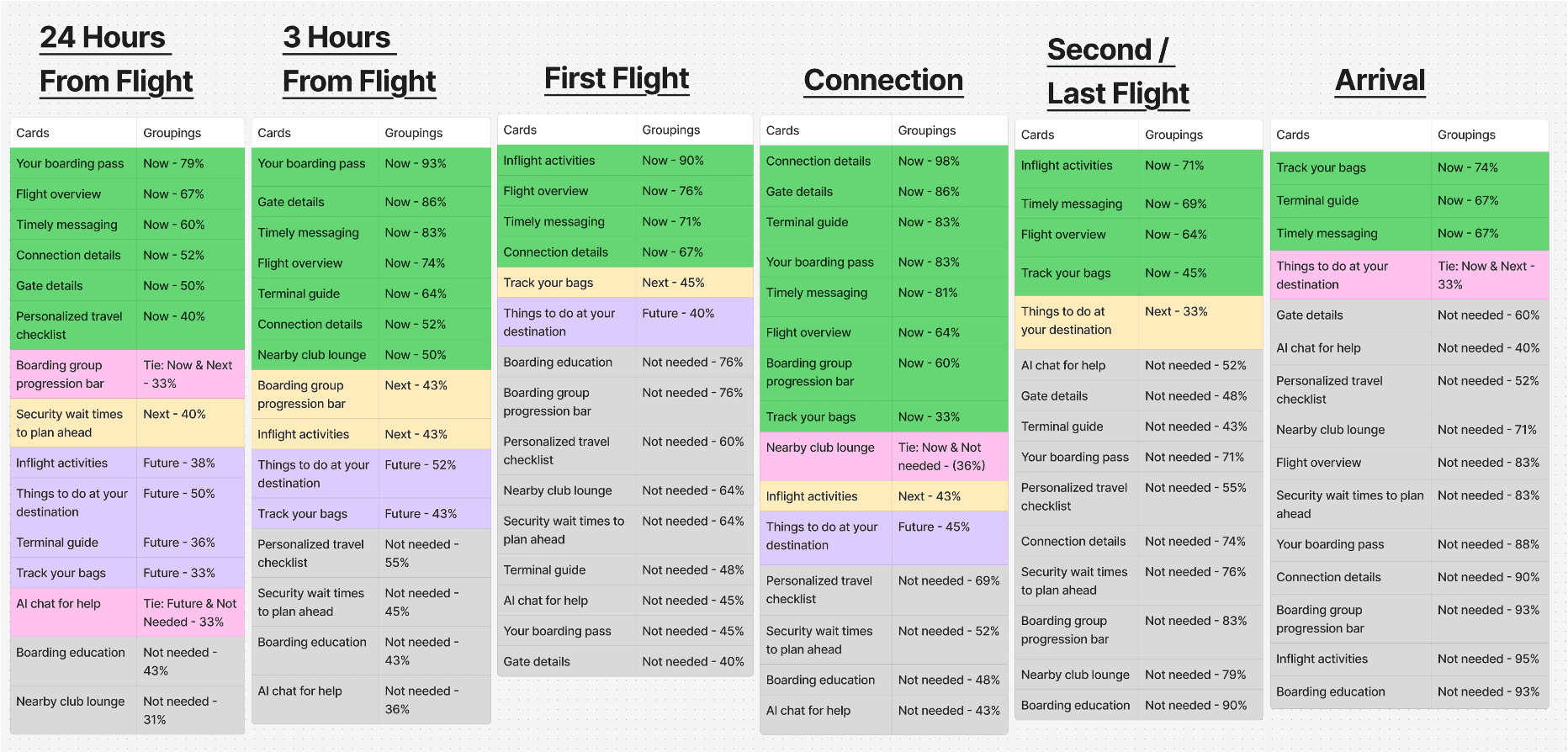
To understand what information mattered most and when, I facilitated a design workshop that mapped the entire customer journey. Working closely with our product owner and data insights team, we identified the key moments that would shape our design decisions. We reviewed app click-rate metrics, analyzed customer pain points at different flight stages, and established a clear information architecture framework.
We created a framework that organized travel mode into three key information zones, based on urgency and the customer's decision-making timeline:
To validate this framework, I partnered with our research team to conduct card sorting tests with real customers. Participants were shown all the features we planned to include and asked to place each one into the category they felt it belonged to based on their travel journey—whether dropping bags, at the gate, in-flight, or during connections. The results gave us high confidence to move forward with our information hierarchy.
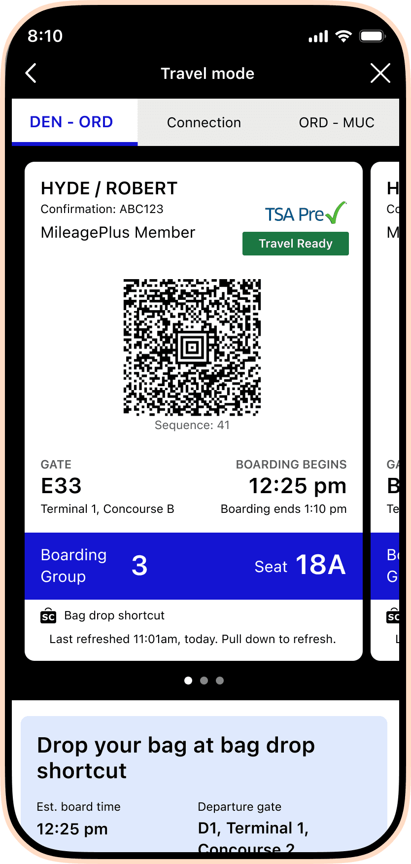
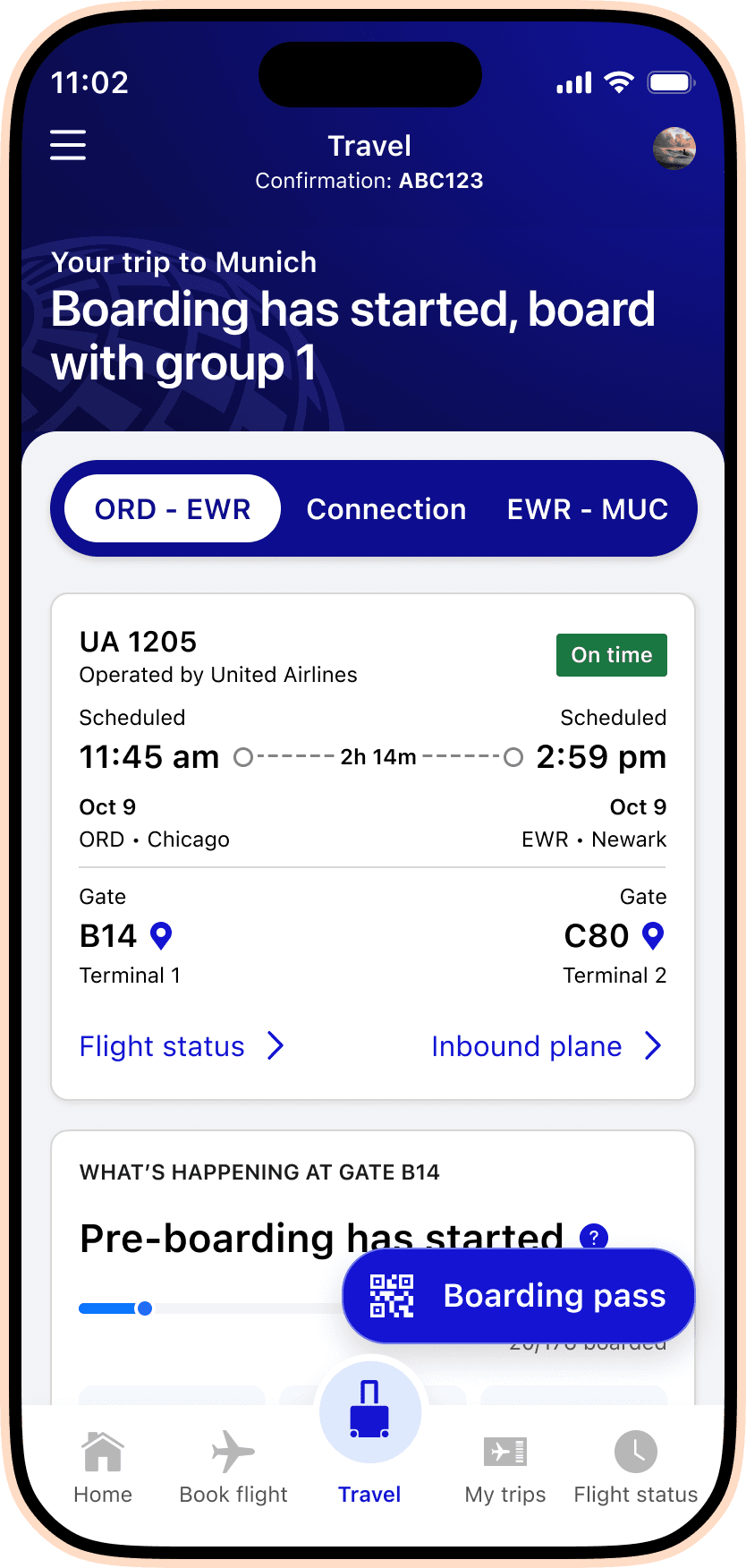
Our design journey started with low-fidelity wireframes that included two key non-negotiables: secondary navigation to make content discoverable, and a dedicated boarding pass experience. Early user testing revealed a critical insight for Travel mode phase MVP: customers didn't scroll below the fold. The boarding pass—while operationally important at airports—was taking up too much vertical space and pushing other features out of view.
United's design system is intentionally minimal—white space, black text, and United blue. But Travel Mode needed to feel premium and to set a new visual direction for the app's future. I partnered closely with our design systems team to explore how we could enhance the current components while respecting brand constraints. We tested color blocking, gradients, and layering approaches before landing on a cohesive look that elevated the entire experience.
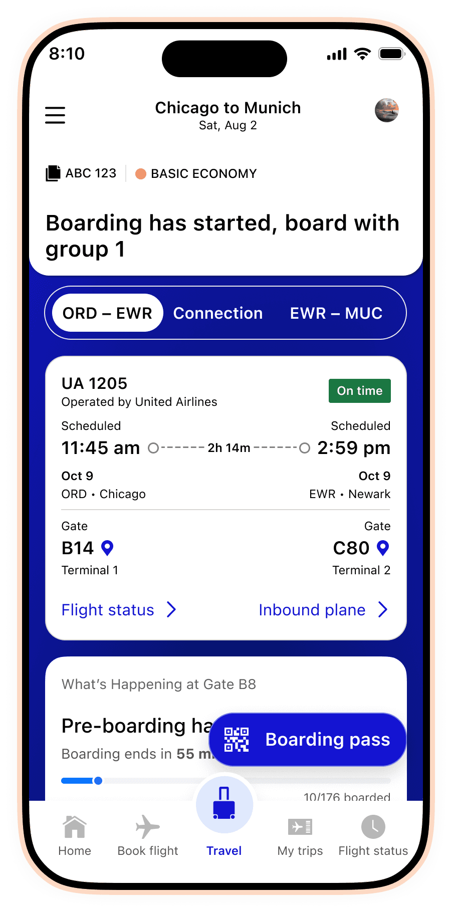
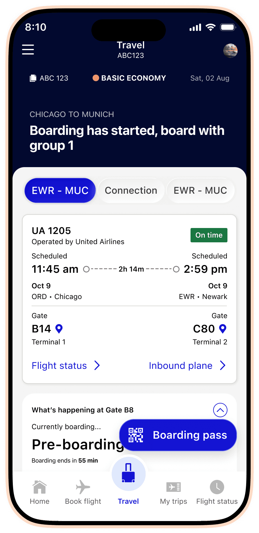
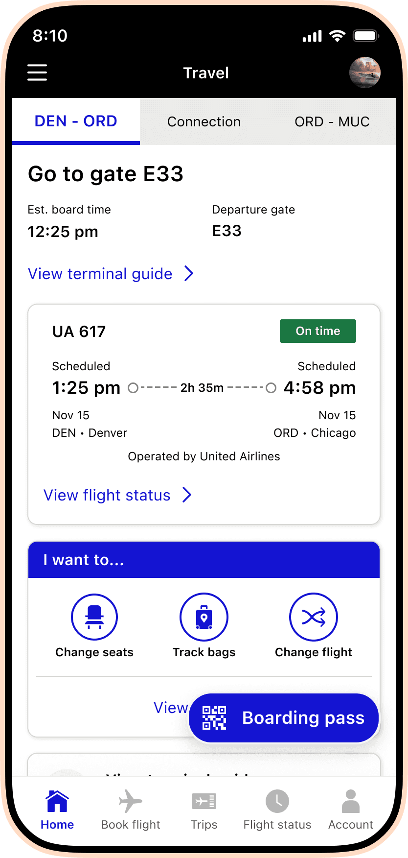
The final visual language uses a subtle blue gradient backdrop with opacified blue cards for widgets, creating visual hierarchy without overwhelming the interface. This approach gave us the flexibility to highlight the most critical information (boarding progression, gate details) while maintaining the clean, trustworthy aesthetic United is known for.
The team of four designers each owned 2–3 widgets. Beyond managing feedback and guiding the overall vision, I contributed three critical features that demonstrate how deeply we listened to operational teams and customers alike.
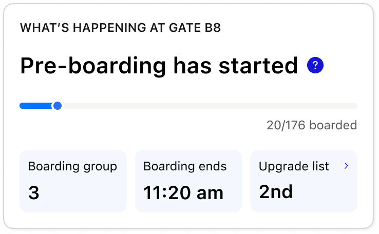
1. Boarding Progression Transparency
Working with the gates operational team, I designed a boarding progression widget that shows exactly where customers stand in the boarding process. The gates team provided data on boarding count and group, but I recognized we could leverage additional signals: group number, boarding start/end times, and upgrade placement. This aligns with the physical signage at each gate and provides customers with the transparency they need to decide whether to stay at the club or head to the gate.
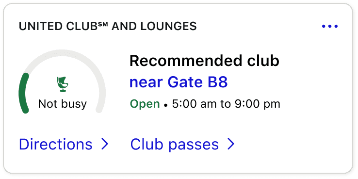
2. Club Busyness & Recommendations
The United Clubs team was rolling out beacon technology to measure how many customers were entering and exiting clubs at each airport. Many airports place clubs at the end of the terminal, so customers were walking long distances only to find them full. We designed a busyness indicator (using a circular dial) paired with the nearest recommended club, its hours, and quick links to directions and club passes. This single widget consolidated information that previously lived scattered across the app.
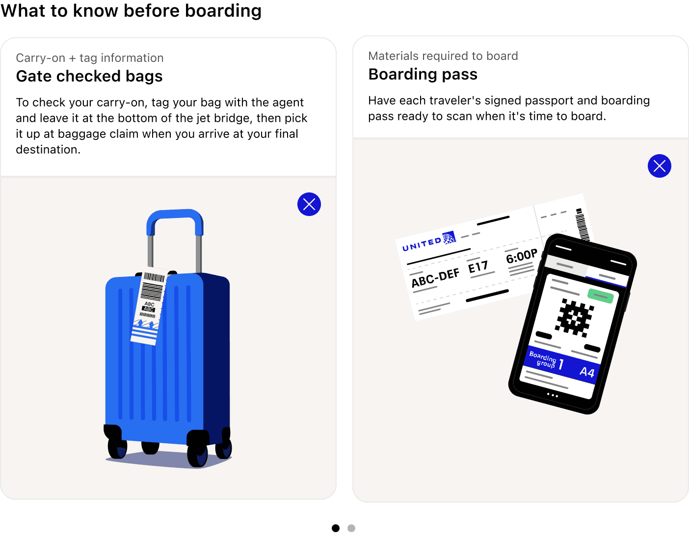
3. Boarding Education Cards
Gate agents repeatedly remind customers to have their passports ready, know carry-on sizing, and check personal item limits. We created educational cards that customers could 'pre-read' before boarding. Each card expands to play a short animated video, making the information accessible without relying on a gate agent to repeat themselves. We had modest expectations for this widget since educational content typically gets overlooked—but the results were stunning.
Travel Mode went live right before Christmas 2024. The response was immediate and overwhelming. Within weeks, we saw the app reaching new heights in engagement and customer satisfaction. But beyond the metrics, the human impact stood out.
“I'm deaf and this past flight with them with this feature [boarding progression] was immensely helpful. I no longer need to ask to be boarded first with the other disabled passengers and I don't have to worry about missing anything.”
This comment perfectly captures what we set out to achieve: designing for everyone, ensuring transparency and trust, and recognizing that every traveler has different needs and reasons to fly. By prioritizing discoverability and accessibility, Travel Mode became a tool that served all customers—regardless of ability, familiarity with the app, or travel style.
Travel Mode launched as Phase 0 of a larger vision. The framework we built—Now, Next, and Future information states—is extensible and ready for new features. Future phases will expand the experience across more customer touchpoints, integrate real-time flight data, and continue building on the accessibility-first approach that made this launch successful.